Why Apple’s Old UI Was Peak Brain Rot (The Case Against Digital Woodgrain)
The Great Digital Lie: A History of Unnecessary Texture
Before 2013, before iOS 7 wiped the slate clean with Jony Ive’s signature flat design, the iPhone’s interface was a monument to skeuomorphism. For the uninitiated, skeuomorphism is when an on-screen element mimics its real-world counterpart. Think of the floppy disk icon for “Save”—an object most modern users have never touched.
For early iPhone users, this made things easy. The app was a familiar, physical metaphor, easing the transition into the touch-screen era. But by iOS 6, it had escalated into genuine, grade-A digital brain rot.
The Three Pillars of Skeuomorphic Chaos
Apple’s design team wasn’t just mimicking reality; they were using a bizarre, maximalist reality that only existed in a 1950s gentleman’s club.
1. The Leather-Bound Calendar and Digital Stitching
The Calendar app was encased in digital leather with visible, unnecessary stitching. The Notes app looked like a legal pad complete with yellow paper and ruling. Why did we need our screens to smell like an old briefcase? The textures were so detailed, so high-resolution, they actively distracted from the content.
2. Game Center’s Casino Nightmare
The most egregious offender of all. Game Center was a digital relic, rendered in a hideous shade of felted green that screamed “smoke-filled Vegas casino carpet.” The interface was claustrophobic, busy, and entirely non-functional. It was a digital design choice based on feeling a certain way, rather than working efficiently. It achieved peak brain rot because it was so aggressively ugly, yet we accepted it as “Apple design.”
3. The Obsession with Glare and Depth
Every icon from the Calculator to the Settings cog looked like it had been molded out of glossy plastic, then hit with a direct spotlight. The infamous “Aqua” buttons of macOS desktop were all about gradients and reflections—they were trying too hard to be 3D on a 2D surface. This relentless pursuit of depth was visually exhausting.
The Skeuomorphism Paradox: Why It Died
Skeuomorphism had to die because it stopped serving the user and started serving the designer’s ego. As we became experienced smartphone users, we no longer needed the crutch of a “digital trash can” to understand the delete function. We were ready for abstraction, and iOS 7 finally gave us the cleaner, flatter interface we deserved.
For a closer look at the new aesthetic, check out our review of the Liquid Glass UI in the iOS 4.0 Beta 4 update, where we discuss Apple’s latest return to subtle depth.
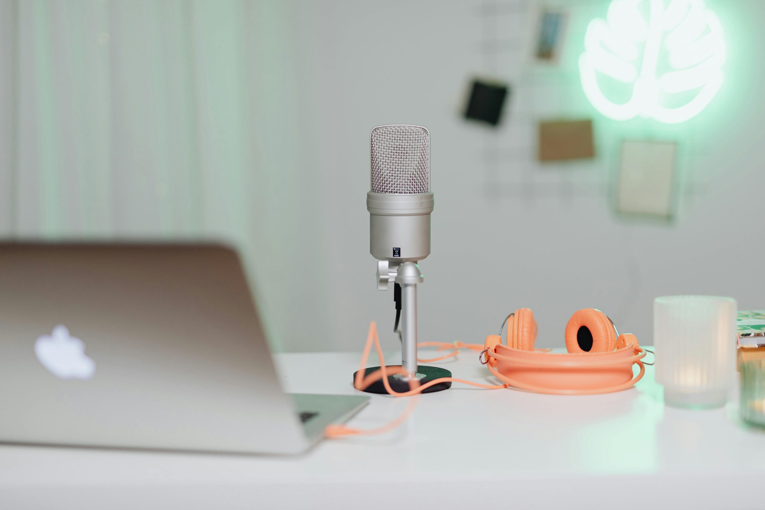
The old UI was brain rot because it forced us to look at digital stuff instead of digital information. But admit it—doesn’t the lack of that satisfying, metallic microphone on the Voice Memos app make you a little sad? A little bit of the bizarre charm of early iPhone ownership is lost forever.